- VolFix.Net
- Графики
-
 Ошибки

0
Не ошибка
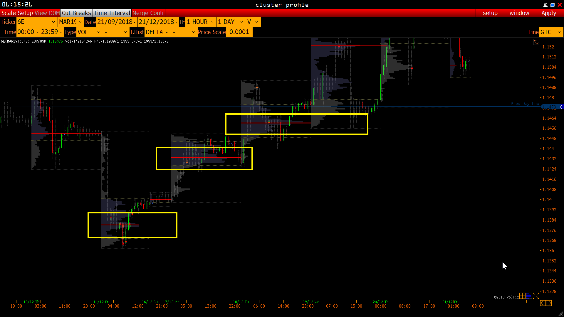
POC Line
The POCs in my chart looks a bit confusing..
.. the first one is bold and ends at the end of the volume profile..
.. the second one is thin and ends at the end of the day..
.. the third one is thin and goes into the following day.
Looks like a bug?!
Сервис поддержки клиентов работает на платформе UserEcho
Hello!
No it is not a bug.
The bold line - it is volume profile line.
The thin line - it is not line, it is ray to same price in the future (in case it is possible)
Ok, thanks. Where can I switch the ray off?
Yes,
Setup - TF2 options